

You open Aave in one tab, Uniswap in another, a bridge in a third, and a spreadsheet in the fourth because you no longer trust your memory. Somewhere in that mess, you're trying to answer a simple question: what is my stablecoin capital earning right now, and where is my risk sitting?
That's the daily reality for a lot of DeFi users. The problem usually isn't access. It's visibility. You can deploy capital almost anywhere, but seeing your whole picture without stitching it together by hand is the hard part.
A good DeFi dashboard fixes that. A great one changes how you make decisions. And once you've used one long enough, you start to see the next limitation too. Even with perfect visibility, you're still the one checking, comparing, and rebalancing.
The DeFi Chaos You Know Too Well
A familiar workflow starts innocently enough. You park stablecoins in a lending market, add liquidity somewhere else, maybe test a Pendle strategy because the yield looks interesting, then leave a little idle cash on another chain because bridging it felt like one task too many.
A week later, your “simple” setup has become operational overhead.
You check wallet balances in one app, protocol positions in another, and token prices somewhere else. Rewards accrue in different tokens. Fees chip away at returns. One stablecoin pool still looks attractive, but now you need to verify whether that yield is coming from sustainable activity or just temporary incentives.
Where manual tracking breaks down
The issue isn't only inconvenience. It's decision quality.
When your information is scattered, you start making choices with partial context. You might move funds because one protocol shows a higher yield, while missing that your current position has lower hidden costs or better liquidity. You might think you're diversified because you use several apps, while most of your exposure still traces back to the same chain, the same stablecoin, or the same smart contract assumptions.
A lot of users compensate with spreadsheets. That works for a while. Then reality intrudes.
Balances drift: Wallet values change faster than manual entries.
Rewards complicate accounting: Earned tokens can distort your view of actual return.
Cross-chain positions blur together: It's easy to miss where idle capital is sitting.
Risk gets buried: You remember the headline APY and forget the conditions behind it.
The most expensive mistake in DeFi usually isn't a dramatic exploit. It's allocating capital with an incomplete picture.
This is why people eventually stop asking for “a nicer portfolio app” and start needing a proper operating panel. Not because they love dashboards, but because the alternative is constant context switching.
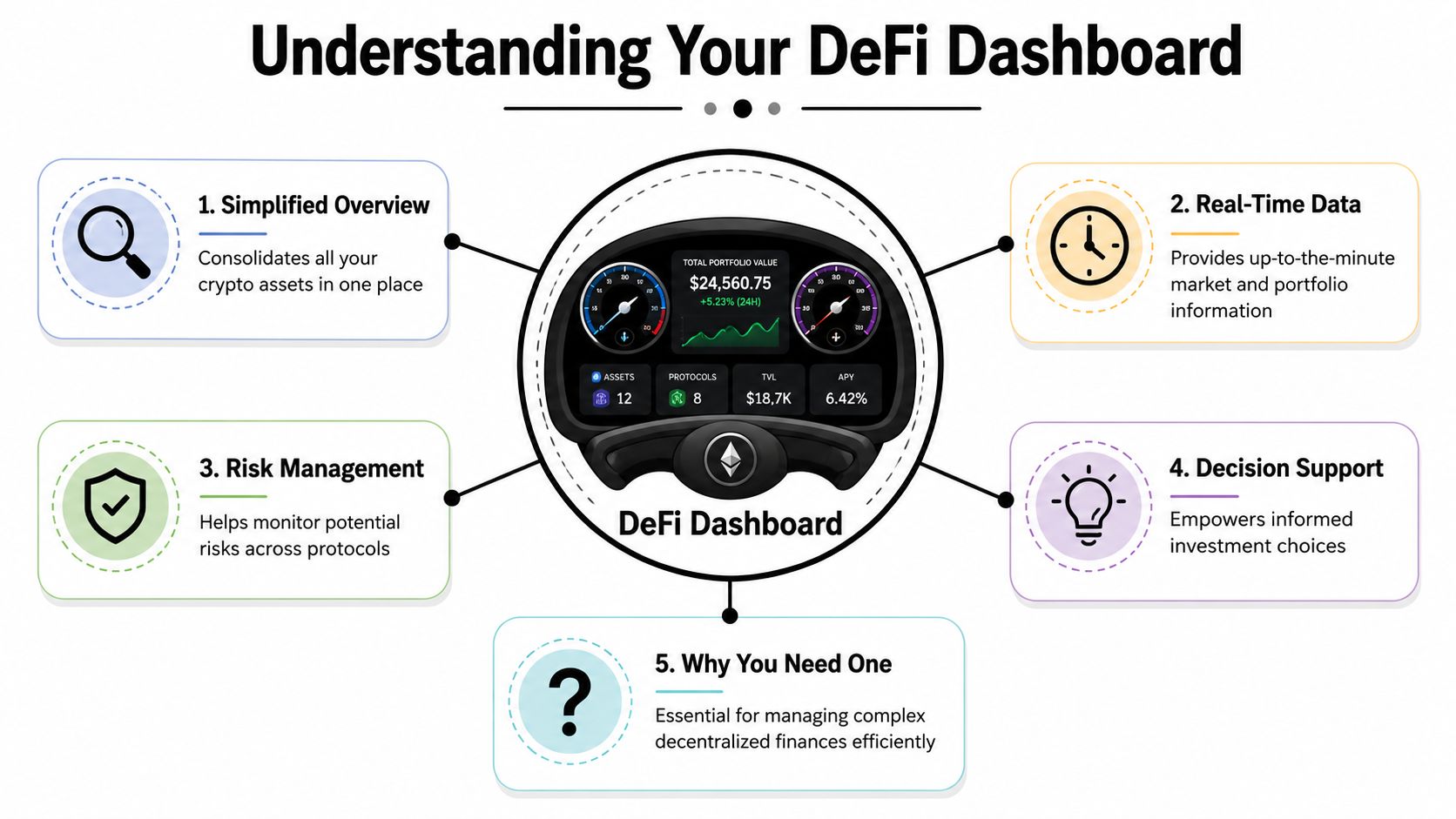
What Is a DeFi Dashboard and Why You Need One
You check one wallet and see USDC in Aave. Another wallet holds LP tokens on Arbitrum. Treasury funds sit in a multisig. Rewards are accruing somewhere, borrow exposure is sitting somewhere else, and the yield number you remember is already stale. A DeFi dashboard pulls that scattered state into one working view so you can make allocation decisions without hunting through five apps and three chains.
A DeFi dashboard works like an operating panel for on-chain capital. It aggregates wallet balances, protocol positions, debt, rewards, transaction history, and sometimes cost basis into one interface. The point is not prettier charts. The point is faster, better decisions.
Why this became necessary
DeFi stopped being a single-screen activity years ago. Capital now moves across lending markets, DEX pools, bridges, vaults, staking systems, and multiple wallets at the same time. Finder's research on DeFi statistics and market growth shows how quickly the sector expanded, and that growth changed the user workflow. Manual monitoring no longer breaks down only because it is tedious. It breaks down because the decision surface is wider than any one protocol interface can show.
For stablecoin yield, that matters immediately. A 9% opportunity is not automatically better than a 7% one if the higher rate depends on thin liquidity, volatile reward emissions, or a bridge route you would rather avoid. You need one place to compare the yield, the path to get it, and the exposure you already have.
Why a dashboard is infrastructure, not decoration
A good dashboard reduces context switching. More important, it changes how you think.
Instead of asking, “Which app should I open next?” you start asking better portfolio questions: Where is idle stablecoin sitting? Which positions are producing real net yield after fees? How much of my exposure depends on one chain, one custodian, or one collateral model? That is the shift from checking balances to managing capital.
The simplest way to frame it is this:
Without a dashboard | With a dashboard |
|---|---|
You reconstruct your portfolio manually | You review the full book in one place |
You compare APYs from memory or tabs | You evaluate allocations side by side |
You notice risk after something moves | You spot concentration before reallocating |
You track positions app by app | You manage yield as a workflow |
If you are still piecing this together with explorers and spreadsheets, a dedicated DeFi portfolio tracker for cross-chain yield management will usually save time and improve allocation quality. For a broader view of tools on the market, see Polycool's recommended crypto trackers.
Here is the practical cutoff I use. Once funds are spread across more than one chain, more than one wallet, or more than one yield source, a dashboard becomes basic infrastructure. And once the manual review itself starts taking too long, that is usually the point where users move from dashboards alone to systems like Yield Seeker that monitor opportunities and handle reallocation with less manual work.
Essential Features of a Powerful DeFi Dashboard
Not all dashboards help you make better decisions. Some only repackage wallet balances in a cleaner interface. That's useful for a quick glance, but it won't hold up once you manage stablecoin yield seriously.
A powerful DeFi dashboard does two jobs at once. It gives you a consolidated picture of what you own, and it helps you evaluate what to do next.

Position accounting comes first
The baseline requirement is consolidated position accounting across wallets and networks. MetaMask Institutional described this clearly when it launched a dashboard that pulls data from organization accounts across all EVM networks and surfaces cost basis, profit and loss, historical transactions, and token performance in one interface, as outlined in MetaMask Institutional's dashboard announcement.
That isn't just a nice reporting feature. It's the difference between real yield tracking and self-deception.
If you can't reconcile balances, rewards, realized gains, unrealized gains, and transaction history across networks, your return number is probably wrong. Stablecoin yield looks clean on the surface, but once you factor in swaps, gas, incentive tokens, and movement between protocols, “I'm earning X” can become a very fuzzy statement.
The features that actually matter
Here's what separates a serious dashboard from a cosmetic one:
Multi-wallet and multi-chain aggregation: If you use one wallet for active positions, one hardware wallet for storage, and another address for experiments, you need them visible together. Otherwise, you're still doing mental accounting.
Historical transaction visibility: You should be able to trace what happened, not just what exists now. Current balances without history are like a bank statement that only shows today.
Cost basis and P&L tracking: This matters even for stablecoin-heavy strategies. Returns can be overstated if dashboards ignore entry prices, claimed rewards, or intermediate swaps.
Protocol exposure view: You need to know whether your “diversified” positions are clustered around the same protocol family or risk source.
Alerts and monitoring: Useful dashboards help you catch unusual changes early, especially around stablecoins, exploits, and major position shifts.
Discovery matters, but context matters more
Many users also want dashboards to surface opportunities. That's reasonable. But there's a big difference between a feed of attractive yields and a system that helps you judge whether those yields are worth the risk.
That's why it's worth comparing tools by workflow, not just by screenshots. If you're evaluating options, Polycool's recommended crypto trackers offer a helpful starting point for how different trackers handle aggregation and portfolio visibility. If your focus is specifically DeFi positions rather than general crypto holdings, this guide to a DeFi portfolio tracker is useful for understanding what portfolio-grade monitoring should include.
A dashboard should answer two questions quickly: “What do I have?” and “What deserves attention today?”
If it only answers the first, it's incomplete.
Common Workflows From Passive Yield to Treasury Management
The same dashboard can serve very different users. A solo stablecoin holder wants fewer moving parts. A team managing an operational treasury wants accountability, continuity, and clean records.
Those workflows overlap, but they don't look the same in practice.

The busy professional chasing steady stablecoin yield
This user usually has a simple objective. Keep capital productive without turning yield management into a second job.
Their weekly rhythm often looks like this:
Check current positions across chains.
Review whether the current strategy still offers acceptable yield.
Compare a few alternative pools or lending markets.
Move only if the improvement is meaningful after fees, effort, and risk.
That sounds straightforward. It isn't, unless the dashboard is doing real synthesis. Stablecoin holders don't just need balances. They need a clean view of idle funds, current returns, and where concentration is creeping in.
A useful habit here is to treat the dashboard like an air traffic display. You're not trying to stare at every plane. You're trying to spot what changed since the last check.
Capital sitting idle: often the easiest problem to fix.
Rewards accumulating in side tokens: small drifts can distort your actual exposure.
Yield compression in current positions: a once-good allocation may no longer justify the risk.
Chain sprawl: funds scattered across networks can subtly reduce efficiency.
The team running an on-chain treasury
Treasury management changes the requirements completely. Now the dashboard has to serve finance, operations, and risk review at the same time.
Crypto enterprises are explicitly adopting DeFi reporting modules for live and past position tracking, and vendors now market stablecoin and exploit-monitoring panels as part of a broader control stack for teams managing funds across chains, according to Cryptio's overview of DeFi reporting modules. That matches what treasury operators already know. You can't run team capital with the same habits used for a personal wallet.
A treasury lead needs things a passive investor may never ask for:
Passive yield user | Treasury operator |
|---|---|
Current balances | Live and historical positions |
Yield comparison | Audit-friendly reporting |
Simple monitoring | Continuous controls |
Personal context | Shared operational visibility |
For teams, this often connects directly with broader stablecoin treasury management practices. The dashboard isn't only tracking return. It's preserving operational memory.
Later in the workflow, teams usually need a visual review layer for stakeholders or collaborators. This short walkthrough is the kind of format many people find easier than reading protocol docs.
When multiple people touch capital, the dashboard stops being a convenience tool and becomes part of governance.
How to Read a Dashboard and Interpret Yield Metrics
Open a dashboard after a busy week and the same trap shows up every time. One pool is flashing a double digit APY, another looks safer but pays less, and your wallet balance says nothing about whether staying put is still the right call.
A good dashboard helps only if you read it as a decision tool. The job is simple. Figure out whether your current stablecoin allocation still earns enough after costs, risk, and exit friction.
Start with three questions:
What am I earning after gas, swap costs, and claim friction?
What risk am I taking to earn it?
What specific change would justify moving capital?
That order matters. Dashboards usually lead with the most attractive number. Your workflow should lead with what you keep.
APY, APR, TVL, and what they actually mean
APY and APR are not interchangeable. APR is the base rate without compounding. APY assumes compounding happens. In practice, that difference matters only if rewards can be harvested and redeployed often enough to make the math real. If you need to claim manually, pay gas, sell a reward token, and re-enter the position, the displayed APY can be more marketing than outcome.
TVL has the same problem. It is useful context, not a verdict. High TVL often means better liquidity and more market attention. It does not remove smart contract risk, governance risk, or exposure to a weak underlying asset. Low TVL does not automatically mean avoid. It means size the position more carefully and watch exits more closely.
Use the metrics like a pilot uses instruments. No single gauge is enough.
Metric | What it helps answer | What it does not guarantee |
|---|---|---|
APY | What repeated compounding could produce | What you will keep after real execution costs |
APR | The base yield rate | Your realized return |
TVL | Liquidity and participation context | Safety or long-term durability |
Fees and inflows | Whether activity appears current and supported by usage | That incentives will hold or withdrawals will stay easy |
Read the gap between displayed yield and usable yield
The useful comparison is not pool A at 12% versus pool B at 7%. It is 12% with reward token risk, shallow liquidity, and two extra transactions versus 7% in a simpler position you can exit cleanly.
That is the difference between displayed yield and usable yield.
For stablecoin capital, usable yield usually wins over flashy yield. A lower rate from a cleaner setup can outperform a higher rate that depends on volatile incentives or frequent maintenance. Busy operators learn this quickly. Every extra step in a strategy creates another place to lose return, lose time, or make a mistake.
A simple review process works well:
Check the source of yield. Lending interest, trading fees, token emissions, or some mix.
Check how rewards are paid. Stable asset, governance token, or rebasing token.
Check the path out. Can you exit in size without heavy slippage or cooldown delays?
Check whether the rate is sticky. Fresh incentives often fade once capital arrives.
Protocol-level dashboards are useful here because they add context beyond your wallet view. Pages like DefiLlama's protocol analytics make it easier to compare fee generation, liquidity depth, and capital flows before chasing a headline number.
Compare the full route from deposit to withdrawal, not the number printed at entry.
If the math on a dashboard looks better than the money you are collecting, use a quick APY calculation framework to test whether compounding assumptions, reward volatility, or fees are distorting the picture.
A practical filter for stablecoin yield decisions
This is the part many feature roundups skip. Reading a dashboard is not about memorizing labels. It is about setting rules before a new number tempts you to act.
Use a filter like this:
Treat unusually high yield as a prompt to investigate. Ask what risk or subsidy is creating it.
Discount rewards paid in volatile tokens. A posted rate can fall fast when the reward token sells off.
Prefer simpler positions when returns are close. Fewer steps usually means fewer failure points.
Value exit quality. A good strategy should be easy to unwind when conditions change.
Set a move threshold. Reallocating for a small yield bump often is not worth the operational drag.
That is also the point where manual dashboards start to show their limits. They are good at surfacing options. They are weaker at enforcing discipline across many protocols and chains. For users who want stablecoin yield without constant rechecking, tools like Yield Seeker matter because they shift the workflow from watching tables to setting rules and letting automation handle the repetitive scanning.
Navigating Security and Privacy Risks
A DeFi dashboard gives you visibility into your portfolio. It can also become a risk surface if you treat every connection request casually.
The biggest distinction to keep in mind is this: viewing wallet data is not the same as approving token movement or signing transactions. A dashboard may only need read access for portfolio tracking, but some tools also push you toward actions, swaps, deposits, or approvals. That's where mistakes happen.
What usually goes wrong
The classic failure mode is convenience. A user connects a wallet, clicks through approvals too quickly, and grants broad permissions to a contract they haven't vetted. If that contract is unsafe or the interface is spoofed, the wallet can be exposed far beyond the single action the user intended.
Phishing is the other constant threat. A convincing copy of a known dashboard can look legitimate enough to capture signatures from rushed users.
The practical baseline
A few habits do most of the heavy lifting:
Use a hardware wallet: Keep meaningful funds behind a device that forces explicit review.
Separate roles by wallet: Use a primary wallet for core holdings and a burner wallet for trying new protocols.
Review approvals regularly: If you no longer use a protocol, revoke permissions instead of letting them linger.
Slow down on signatures: If the prompt is unclear, stop. A few extra minutes beats explaining a drained wallet later.
Minimize personal data sharing: A dashboard built on public blockchain data shouldn't need excessive private information for basic visibility.
Privacy matters too. Dashboards aggregate public on-chain information into a cleaner view. That's useful, but it also means you should think about what identities, emails, or off-chain profiles you're linking to wallet activity.
Beyond Manual Dashboards The Rise of AI Automation
A dashboard is a major upgrade over tab chaos. It gives you a map. But it still leaves you doing the driving.
That's the limitation many stablecoin holders run into after the initial relief. The visibility problem gets solved, then the workflow problem remains. You still have to check rates, interpret risk, decide whether to move, and monitor whether that move still makes sense tomorrow.
Where dashboard fatigue sets in
Manual dashboard use works best when you enjoy active oversight or when your setup is simple. It works less well when DeFi is supposed to be a background income strategy instead of a recurring research project.
That's where automated tools start to make more sense. Instead of only presenting the overview, they act on a defined objective.

For stablecoin users who want less manual oversight, Yield Seeker is one example of that shift. It provides an AI-powered workflow for monitoring and allocating stablecoin capital across DeFi protocols in real time, with a dashboard that shows balances, earnings, transaction history, and agent activity. That changes your role from constant operator to strategic reviewer.
A manual dashboard tells you what's happening. Automation can handle what happens next, within the boundaries you're comfortable with.
The important distinction isn't dashboard versus no dashboard. It's information alone versus information plus execution. Once you know what good monitoring looks like, the next question is whether you still want to be the one checking every screen and moving every dollar yourself.
If you want a lower-friction way to put stablecoins to work, Yield Seeker offers an AI-powered approach that pairs dashboard visibility with automated yield allocation, so you can monitor performance without manually hunting protocols every day.