
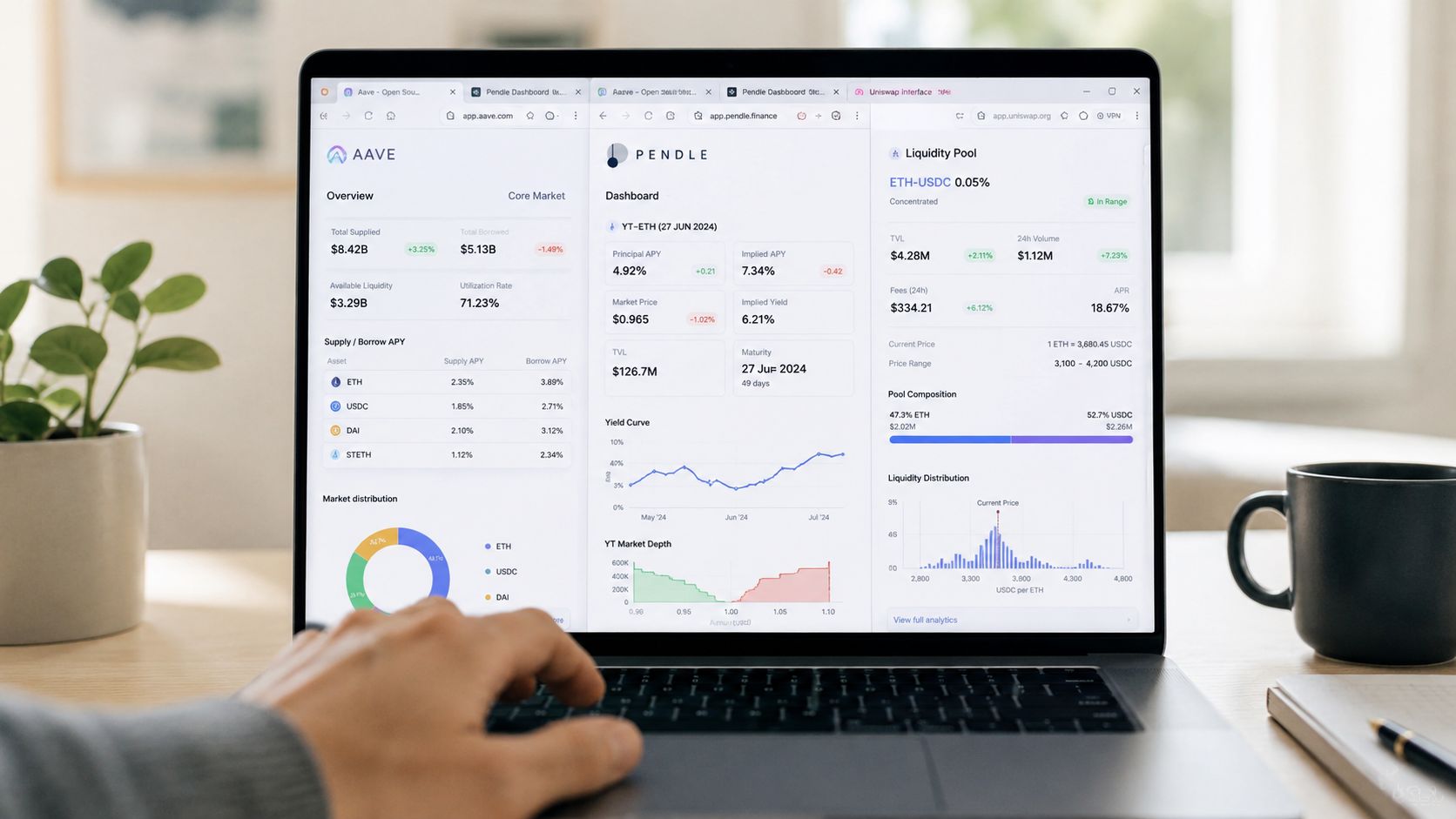
You're staring at five tabs, two spreadsheets, and a Telegram bot, trying to answer one simple question: is the stablecoin setup working? Aave says one thing, Pendle says another, the LP position drifts after fees, and the AI agent's summary doesn't reconcile with your wallet. That's the part most guides skip. The hard problem isn't finding a dashboard, it's building a measurement system that still tells the truth when the data is fragmented.
A lot of DeFi teams start by collecting charts, not by defining what success means. That's why the dashboard looks complex and still fails the smell test. The essential work is closer to the guidance to establish a baseline, keep the KPI set limited, and make sure the numbers are clean enough to act on, which is exactly the kind of discipline government performance guidance recommends for public services when it says to set a baseline, publish KPI data, and check statistical significance and data quality before acting on results (UK Government guidance on setting performance metrics).
If you've ever felt that a pretty dashboard was hiding a messy back end, the critique in stop arguing over numbers in reports lands hard, because the dashboard itself isn't the source of truth. The source of truth is the measurement framework underneath it. A decent internal comparison of dashboard-heavy and agent-driven workflows is also worth a look in this DeFi dashboard versus AI agent discussion, since the question isn't which interface looks smarter, it's which system can survive real-world data drift.
The Dashboard Problem Nobody Talks About
The most common DeFi failure mode is simple. You open Aave, a portfolio tracker, a spreadsheet, and a Telegram alert, and each one tells a slightly different story about yield. None of them are lying on purpose, but they're often measuring different slices of the same position, on different refresh schedules, with different assumptions about fees, price feeds, and whether “yield” means unrealized accrual or realized profit.
That's why dashboard selection is the wrong starting point. Tools don't define performance, objectives do. If the goal is stablecoin yield, treasury growth, or risk-adjusted return, then the dashboard is just the display layer on top of a measurement design that needs to survive fragmented sources.
The first question is not “What do I install”
The first question is “What decision will this metric support?” If a metric can't trigger an action, it's probably decorative. Many DeFi setups become vanity dashboards, full of TVL, wallet counts, and protocol labels that look professional but don't help you decide whether to rebalance, hedge, or pause a strategy.
The better pattern is to start from the decision, then define the metric, then define the source. That's why KPI guidance recommends a short list of meaningful metrics instead of tracking everything that's easy to measure, and why modern performance tracking moved from ad hoc reporting toward structured measurement systems built around targets, baselines, and regular review cycles (KPI development guidance). In practice, a single page with a handful of ownable metrics beats a wall of charts every time.
Practical rule: if two dashboards disagree, don't average them. Trace each number back to the contract, wallet, or pricing feed that produced it.
The useful framing is brutally unglamorous. Measurement is design work. When the framework is right, the dashboard becomes a convenience. When the framework is wrong, the dashboard becomes a distraction.
Choosing the Few Metrics That Actually Matter
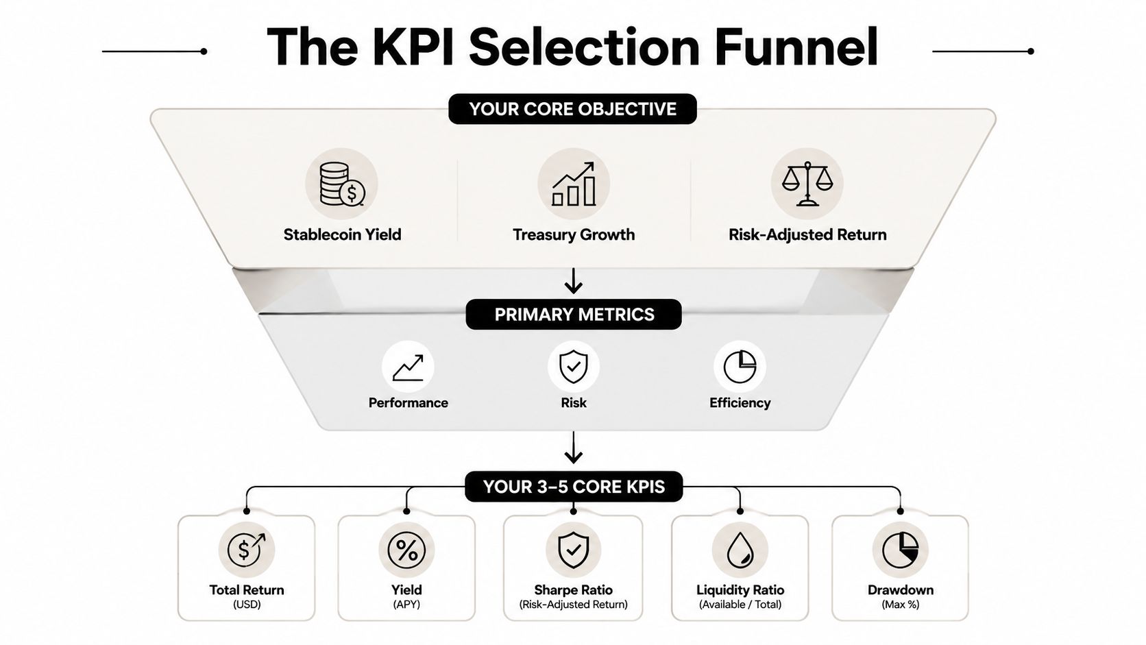
A stablecoin strategy needs fewer metrics than you might think, but each one has to be written clearly enough that a second person could reproduce it. That's where objective-first KPI selection matters. The goal isn't to measure everything. It's to choose 3 to 5 core KPIs that map directly to the outcome you care about, then make each one ownable and auditable.
Turn a vague goal into named metrics
Start with the objective. “Earn more” is too loose. Improve net realized APY is better. From there, narrow the list to the few metrics that explain the result:
Net realized APY, which should include yield after fees and gas.
Drawdown versus peak, which tells you how much capital has fallen from its best point.
Gas cost as a share of yield, which shows whether activity is eating the edge.
Idle capital ratio, which shows how much capital sits unproductive.
Allocation concentration, if one protocol is carrying too much of the result.
That list is small on purpose. KPI guidance emphasizes documenting the definition, formula, data owner, source system, refresh frequency, and threshold before launch, because ambiguity ruins trend analysis. If one team treats pending yield as performance and another uses only realized yield, the KPI stops being comparable.
Write each KPI like a contract
A useful KPI definition fits on one line. For example:
Net realized APY = realized yield after fees and gas, over a stated period.
Drawdown versus peak = current value compared with the highest prior value in the chosen window.
Gas cost as a percentage of yield = gas spent divided by realized yield.
Idle capital ratio = idle capital divided by total capital deployed.
Those formulas don't need to be fancy. They need to be repeatable. The owner matters as much as the metric, because ownership answers the awkward question of who fixes the number when it drifts. In a DeFi setup, that owner might be you, a treasury operator, or an automated agent, but it still has to be explicit.
If you want a sanity check from a different domain, code quality metrics that matter makes the same underlying point, the metric only helps if the definition is stable enough to trust over time. That's the same reason a performance dashboard should have a metric owner, not just a chart owner.
Practical rule: if you can't write the KPI in one sentence with a formula and an owner, it isn't ready.
Wiring Up Your Data Sources Without Lying to Yourself
Once the KPI list is set, the next step is plumbing. That work breaks more setups than the metric selection itself, because the same strategy can be observed through wallets, contracts, indexers, APIs, and price feeds, and each layer can introduce a different kind of error. A clean measurement system keeps every KPI traceable to a named source, with a clear rule for what wins when tools disagree.
A DeFi builder usually feels this pain the first time a dashboard says one thing and the chain says another. For a stablecoin position, that mismatch can hide whether the problem is in the contract read, the wallet view, or the price feed. Yield Seeker's portfolio tracker approach is useful here because it treats source mapping as part of the product, not as an afterthought.
Map each metric to a source of truth
For a multi-protocol stablecoin strategy, the source map usually looks like this:
Aave supply positions should come from on-chain reads or an indexer, not a copied dashboard total.
Pendle PT positions should be read from the protocol position data or the wallet's on-chain holdings.
Curve LP exposure should be traced to the pool contract and the wallet address holding the LP token.
Stablecoin balances should come from the wallet, not a summary layer that may lag.
Cost basis and trade history often need exchange APIs or transaction records.
Valuation needs a price feed that you trust consistently.
That sounds obvious until a tracker and a wallet view disagree. Contract state determines position size. Wallet balance determines cash. Accounting records determine cost basis. Everything else is presentation. That discipline keeps a yield report from turning into a story people want to believe.
Build a one-page data flow diagram
Draw the KPI first, then trace the inputs. If net realized APY depends on realized rewards, gas, and fees, each of those needs a direct path from source to report. If idle capital ratio depends on deployed versus unused funds, you need a clear rule for what counts as idle. If drawdown depends on portfolio value, then the price feed matters as much as the protocol position.
Automation helps only after the data map is clean. Real-time systems like WebSocket streams for Solana are useful when you need fast event visibility, but speed does not repair a broken definition. It only moves bad input faster.
Keep the diagram one page, name the source for each KPI, and write down the fallback if the primary source fails. If a number cannot be traced back to where it came from, it is not being tracked, it is being watched.
Dashboards, Alerts, and the Right Cadence for Each Metric
A DeFi operator usually learns this the hard way. A dashboard can look busy, color-coded, and “live” while still hiding the one number that would have changed the next move. If you track everything as if it needs immediate attention, the important signals get buried under noise.
Match cadence to the decision
Use the cadence to match the decision, not the preference of whoever built the report. A metric that affects execution needs a faster review cycle than one that only changes how you think about allocation. A structural risk metric can sit in a slower cadence because the point is to catch drift, not react to every small move.
Metric type | Best cadence | Why it belongs there |
|---|---|---|
Operational | Weekly | Good for yield changes, execution quality, and short-term drift |
Strategic | Monthly | Better for attribution, capital efficiency, and allocation review |
Structural | Quarterly | Best for risk posture, protocol dependence, and process changes |
That cadence pattern fits guidance that separates review loops by metric type, with shorter cycles for operational checks and slower cycles for long-horizon analysis (KPI development guidance). It also matches KPI systems that pair live dashboards with scheduled reports, so fast-moving signals stay visible while slower decisions stay in a review cycle they can support (Lifthcm KPI guidance).
Use alerts only when action is possible
A dashboard should answer “what changed?” An alert should answer “what should I do now?” An alert with no actionable answer isn't useful. In a DeFi setup, that usually means reserving alerts for things like a drawdown breach, a failed rebalance, or a protocol exposure spike.
Everything else belongs in scheduled reporting. A weekly digest can cover realized yield and gas efficiency. A monthly report can cover allocation quality and protocol contribution. That split keeps the alert channel clean, which matters when you already have wallets, farms, and treasury balances generating enough noise on their own.
If you are reading Telegram all day, a fast alert may help. If you are only checking the portfolio before work, a daily digest and a weekly review may be enough. The trade-off is simple, more immediacy means more interruptions, and more interruptions mean a higher chance you ignore the one message that mattered.
The video below is a useful mental model for the split between live monitoring and batch review.
Practical rule: if an alert doesn't change a decision, move it out of the alert channel and into the report.
Automating Reports So You Actually Read Them
Manual reporting sounds manageable until you do it twice. Then it becomes a chore, and then it gets skipped. Automation helps, but only if it produces a report that fits how you make decisions, not a bloated export no one reads.
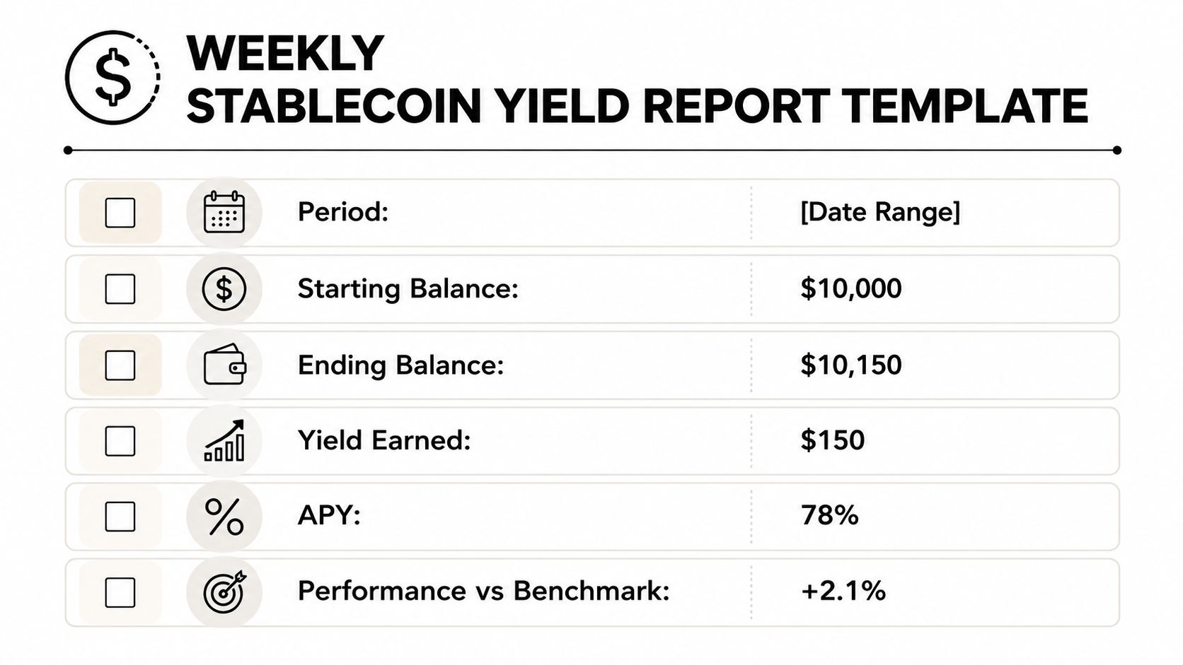
A weekly stablecoin report that stays readable
A good weekly report is short enough to inspect and specific enough to act on. Use this structure:
Period
Starting balance
Ending balance
Yield earned after gas and fees
Top contributor protocol
Biggest mover
One action item for next week
That format keeps the report focused on movement, attribution, and action. You do not need a hundred rows if the only question is whether the strategy improved, stalled, or drifted.
Pick one automation path
The simplest path is usually the best:
Scheduled export from a dashboard tool if the numbers already reconcile.
A Google Sheet or Notion template if you want a lightweight manual review layer.
A Telegram bot digest if you read Telegram every Monday and won't open email.
The point is consistency. KPI guidance recommends regular review loops that collect, visualize, then analyze, which means the automation should make the review easier, not harder. A report that arrives on schedule and uses the same fields every time becomes part of the operating rhythm.
A lot of DeFi teams overcomplicate this step because they want a perfect pipeline before they publish anything. That's backwards. Start with a template, wire in the highest-trust sources first, and let the report get smarter after the habit is in place. If the weekly digest is useful, you can add deeper attribution later. If it isn't useful, more data won't save it.
The fastest win is a single report that answers three questions, did capital grow, what drove the change, and what needs attention next week. If it can answer those three, it's doing its job.
Reading the Numbers Without Fooling Yourself
The hard part is not collecting the number. It is deciding what changed, why it changed, and whether the move deserves your attention. A week-over-week APY drop can point to a real strategy problem, a market-wide rate move, or simple noise. React too fast and you can churn a good setup. React too slowly and a bad one keeps draining returns.
Use a baseline and threshold before you act
A cleaner habit is to compare the current metric with a baseline, then check whether the movement clears a preset threshold. Slack performance monitoring guidance recommends setting baselines and thresholds in advance and automating measurement where possible, because manual checks create lag and inconsistency. A better workflow is to collect at least 30 days of history and keep the test window consistent, as described in the baseline methodology in the brief.
Once the baseline is set, use the same lift formula every time. If the new metric sits meaningfully below the baseline, the next question is whether the change came from your strategy, the market, or your own execution.
Pair leading and lagging indicators
A lagging number alone explains very little. If yield dropped this week, check the earlier signal that tends to move it first. Utilization may have changed. A reward schedule may have expired. Capital may have shifted into a safer but lower-return position. The goal is to connect the outcome to the signal that came before it, instead of treating every dip as a crisis.
Here is the clean way to read it:
Leading indicators show what is building now.
Lagging indicators show whether the strategy already paid off.
Both together cut down on bad conclusions.
That pairing is standard in serious performance tracking, and it is one reason dashboards fail when they only show outcomes. Displaying only realized APY leaves you reactive. Adding allocation shifts, protocol usage, and reward rates gives you context for cause and effect.
The habit that matters most is patience. Compare against the baseline, keep the test window fixed, and do not call a trend because one week looked ugly. That discipline protects more capital than another chart ever will.
Keeping Your Tracking System Honest Over Time
Most tracking systems don't fail loudly. They decay. Fields stop getting filled, metric definitions drift between tools, and the person who understood the spreadsheet leaves the group chat. By the time anyone notices, the dashboard still looks alive, but the numbers have lost their meaning.
Governance is the part people skip
The fix is boring and effective. Give every KPI a current owner, make required fields mandatory in any tracking sheet, and keep a single source of truth for definitions. Then review the metric set itself on a quarterly rhythm and remove anything that no longer maps to the objective. That's the piece often missed, and it's the reason dashboards rot instead of improving.
A recent sales performance guide makes the same point in a different context, saying ungoverned dashboards decay fast and that reliable measurement needs standardized activity definitions, mandatory fields, and a clear RevOps owner (Apollo sales performance guidance). The mechanism is the same in DeFi. If nobody owns the number, nobody fixes the number.
Smart contract monitoring practices are useful here because they reinforce the same governance instinct, track the thing that matters, keep the definition current, and don't let the monitoring layer become decorative.
Monthly checklist: confirm KPI owners, verify source-of-truth links, clean missing fields, and retire any metric that no longer drives a decision.
The best performance systems are not the busiest ones. They're the ones that stay trustworthy after the first month, the first market shock, and the first time a dashboard tool changes how it calculates a field. If your system can survive that, it's tracking performance.
If you want a cleaner way to monitor stablecoin yield without babysitting five dashboards, Yield Seeker is built for exactly that problem. It helps you track, allocate, and review stablecoin performance with less manual reconciliation, which is the difference between watching charts and managing capital.