

You're staring at two DeFi dashboards on the same stablecoin balance. One says 8% APY, another flashes 14% APY, and both look clean enough to trust if you're in a hurry. Then you start asking the annoying questions, like what happens after fees, what happens if rewards are paid in a token that slips in price, and whether you can pull funds out when you need them.
That's where most investors get tripped up with a yield example. The headline number is usually the easiest part of the story, but the part that lands in your wallet is messier. Real yield depends on cash flow, costs, compounding, timing, and the specific rules of the product you're using.
Why Most Yield Examples Mislead New Investors
A stablecoin holder comparing two platforms usually wants a simple answer, not a spreadsheet. One platform looks safer because it advertises a lower yield, while the other looks more exciting because the APY is higher. Then the fine print shows up, and the clean comparison starts to fall apart.
The problem isn't that yield math is hard. The problem is that a lot of beginner content treats yield like a single number instead of a moving result shaped by fees, taxes, price changes, and reinvestment. Finance references draw the line between gross yield, which is return before deductions, and net yield, which is the realized return after them, and that distinction is exactly where many headline numbers become misleading. Investopedia's yield overview
What readers usually miss
The APY is often scanned and then ignored. Few investors ask whether the number includes incentives, whether the reward token can be sold without slippage, or whether the protocol keeps a cut before the return reaches them. That's why a clean-looking yield example can still produce a weak outcome if the asset price drops or costs rise.
Practical rule: if the yield example doesn't show what gets removed before payout, you're not looking at take-home yield yet.
That's especially important in DeFi, where income can come from lending interest, trading fees, or token incentives that don't behave the same way. A dashboard can make two strategies look comparable even when one is much more fragile under stress. The rest of the guide keeps separating the pretty number from the number that matters.
Gross vs Net Yield and the Definitions That Matter
A useful way to think about yield is a rental property. The landlord can advertise rent all day, but that's not what reaches the bank account after vacancies, maintenance, and taxes. Gross yield is the advertised number, while net yield is the amount left after the deductions.
That same split matters in DeFi and in traditional finance. A headline APY can look strong because it captures the full stream of return before the platform's costs and the investor's own costs are considered. Once fees, taxes, and incentive haircuts enter the picture, the number you keep is often smaller than the number you first saw.
APY and APR are not the same thing
APR is the annual rate before compounding is considered, while APY reflects compounding over time. If you're comparing two yield examples, that difference matters because compounding can make a modest-looking rate outperform a larger simple rate over a long enough period. The catch is that the compounding assumption has to be stated clearly, or you're comparing different math.
A clean way to read any yield example is to ask three questions in order.
Is the number gross or net?
Is it APR or APY?
What costs or reinvestment assumptions are hidden underneath?
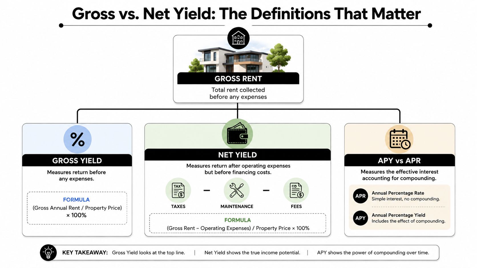
The reason this framing matters is simple. Yield is cash flow per unit of capital, not a promise that you'll end up richer after every other factor is counted. That's why a good yield example should tell you what you're receiving, what gets taken out, and whether the return is being compounded or just quoted.
A Single-Period Yield Example With Real Numbers
Start with a simple position. You deposit $1,000 USDC into a lending vault that advertises 9% APY. The headline looks neat because it tells you what the strategy aims to pay over a year, but the amount that reaches your wallet still depends on what happens along the way.
Start with the headline, then subtract reality
A single-period yield example works best when you begin with the gross figure and then remove the costs that touch the position. In DeFi, that usually means gas, protocol fees, and any haircut on the incentive token before you swap it back into stablecoins. If the reward token trades below the value you expected, your realized yield drops even when the protocol paid the advertised amount.
For this walkthrough, the labeled breakdown is straightforward. The example graphic assumes $12 in gas costs, a 10% protocol fee, and a 25% discount on the incentive token. After those deductions, the position shows $58.50 in net earnings on the $1,000 deposit.

The point is not the exact arithmetic alone. The point is the discipline it teaches. A headline APY shows what the strategy tries to pay, while the net result reveals what remains after the protocol, the chain, and the market take their cut.
The mental template to reuse
A clean way to read a new vault is to trace the money the same way you would follow a dinner bill.
Gross return: what the platform advertises before costs.
Direct costs: gas, fees, and any platform share.
Reward quality: whether incentives are paid in stable assets or in tokens that can move.
Net result: what remains after the conversion back to the asset you care about.
A useful companion to this step-by-step check is a plain guide to how APY is calculated. It helps you separate the quoted rate from the actual path your funds take.
A yield example is only useful if you can trace the path from advertised return to wallet balance.
That habit applies whether the number appears on a dashboard, in a tweet, or in a vault description. If the deductions are hidden, you still do not know what the yield means in practice.
Simple vs Compound Yield Across Time Horizons
Two yield examples can start at the same $1,000 USDC and still end in different places because time changes the math. A simple return grows only on the original principal, while compound return grows on principal plus accumulated gains. That difference becomes more visible as the horizon gets longer.
The table below keeps the comparison clean. The values are illustrative calculations for the same starting capital, and the key point is the shape of the result, not the exact market price of any one protocol.
Horizon | Simple Yield | Weekly Compounding | Daily Compounding |
|---|---|---|---|
30 days | small but steady | slightly higher than simple | slightly higher than weekly |
90 days | noticeably larger than 30 days | compounds more visibly | compounds a bit more than weekly |
365 days | full-year result | higher than simple because gains reinvest | highest of the three because compounding happens more often |
The insight is straightforward. Compounding matters more when the rate is higher and the horizon is longer. If you're parking funds for a few days, the difference may be minor. If you're holding for months and the protocol reinvests earnings, the gap can become meaningful.
For a plain explanation of APY mechanics, the walkthrough on how APY is calculated is useful background.
What happens when the rate changes
Real DeFi rarely keeps one rate frozen long enough for a textbook example. A vault can start strong, then rewards thin out, liquidity shifts, or the protocol changes incentives. If the APY drops halfway through the period, the original example no longer holds, because the later part of the calculation runs on a different rate.
That's why scenario analysis matters more than a static quote. A yield example should answer, “What if the rate falls?” not just “What if everything stays perfect?” If it doesn't, you're looking at a marketing snapshot, not a realistic return model.
DeFi Stablecoin Yield Examples in Practice
A stablecoin balance in DeFi can earn in a few different ways, and the path matters as much as the headline rate. Lending markets, liquidity pools, and automated vaults all produce yield, but each one does it through a different mechanism and with a different risk profile. A yield example only becomes useful once you know which mechanism is paying you.
Start with a blue-chip lending market. The yield often looks modest at first glance, yet the structure is easy to follow, borrowers create demand, and suppliers earn from that demand. A liquidity pool can show a higher number on the screen, but the result depends on trading volume, reward design, and how the pool is built. An automated vault adds another layer, since the strategy can shift capital between opportunities without requiring the user to rebalance by hand.
For a broader comparison of those setup types, the overview on DeFi yield comparison gives a helpful reference point.
Three ways the same $1,000 can behave
Put $1,000 USDC into a lending market and it usually does one job, it sits where borrowers can use it. The return is relatively easy to follow, but the rate can still move as borrowing demand changes.
Place the same $1,000 into a liquidity pool and the income can come from more than one source. Fee design, reward incentives, and price behavior all shape the result, so the figure on the dashboard can look appealing while the actual outcome depends on how the pool behaves over time.
With an AI-allocated strategy like Yield Seeker, automation serves a purpose beyond convenience. The agent monitors supported DeFi opportunities and reallocates capital across protocols in real time based on the strategy rules the user selected, so the yield example itself keeps changing instead of staying fixed. That can improve the risk-adjusted outcome because capital is not left sitting in one place while the rate turns stale.
What changes with automation: the user does not have to chase every new APY by hand, and the portfolio can react faster when rates or conditions shift.
Risk does not disappear. It changes shape. The trade-off moves from manual selection to strategy design, execution discipline, and the quality of the underlying protocols.
Risk-Adjusted Yield and the Examples That Hide Danger
A high APY only looks like a win if the money survives long enough to be paid. A 22% APY farm on a new protocol can look thrilling beside a 7% APY vault on a battle-tested lender, but the headline number doesn't tell you how likely each outcome is to arrive.
The test is risk-adjusted yield. In fixed-income language, yield is the rate that equates price and payments, which is why the same bond can show a different yield as market price moves. That logic carries over to DeFi, where a rate that looks great on Tuesday can turn out to be much less useful once the market, the token price, or the pool conditions change. NABL's bond yield basics
The risks that quietly shrink the number
A high-yield farm can fail for reasons that never show up in the banner ad.
Smart contract bugs: the code can be wrong even when the APY looks perfect.
Depeg events: a stablecoin can move away from its target, which changes the value of the return.
Incentive decay: rewards can shrink when the protocol no longer needs to attract liquidity.
Liquidity crunches: you may not be able to exit cleanly when many users want out at once.
The practical takeaway is to discount the yield by the chance that something goes wrong. A strategy with a modest headline number and a stable payout path can outperform a flashy farm if the latter is exposed to hidden failure modes.
A deeper discussion of that trade-off is available in risk-adjusted APY analysis.
The same logic applies when a protocol changes rates quickly. A number that looked attractive at entry can become irrelevant if the position becomes hard to exit, expensive to unwind, or too fragile to keep running. That's why a yield example needs a risk lens, not just a return lens.
How to Evaluate Any Yield Example Before You Deposit
A good yield example should answer five checks before you move capital.
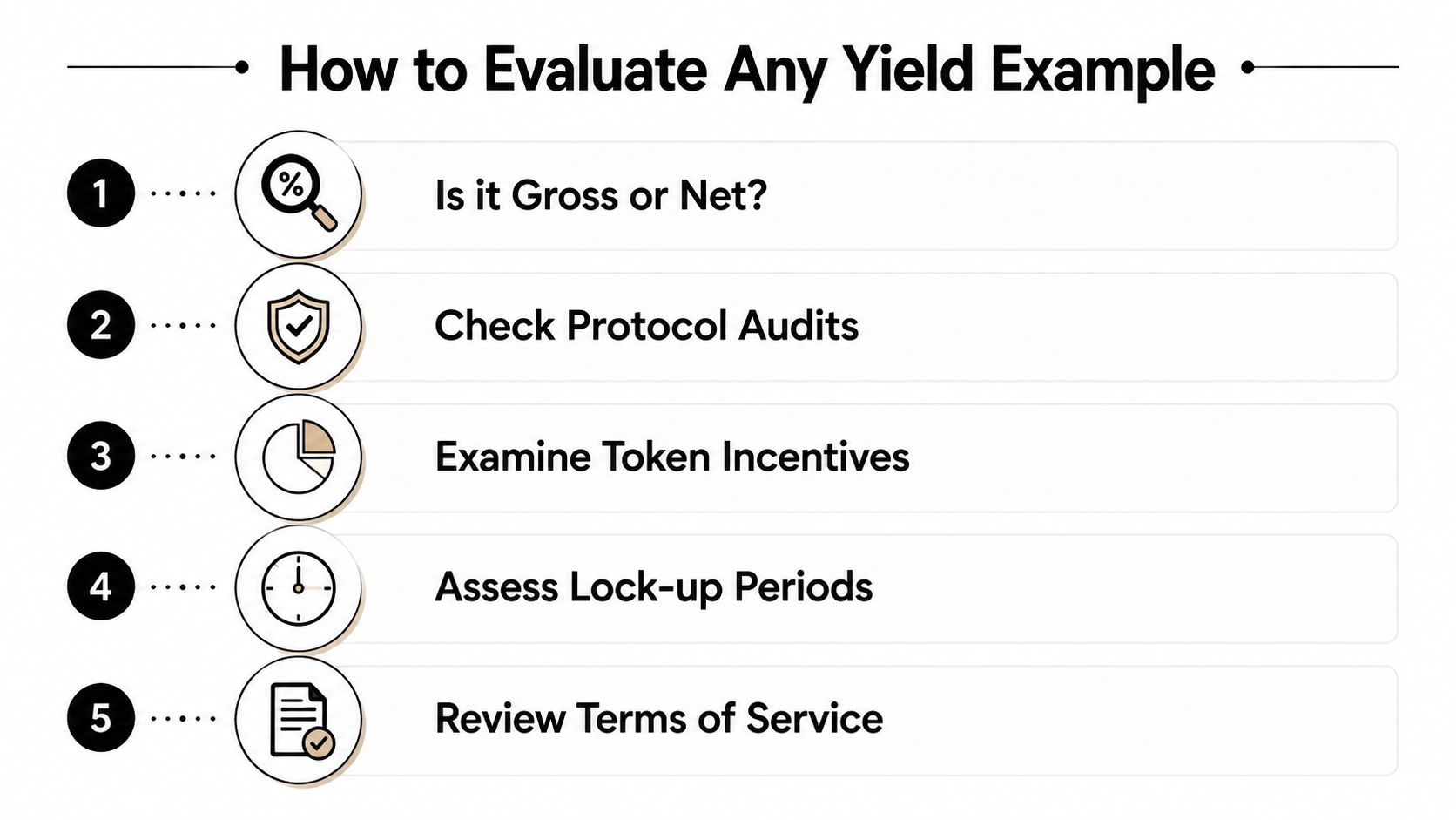
Is it gross or net? If the number is pre-fee, treat it as a starting point, not your paycheck.
What compounding assumption is used? APR and APY don't mean the same thing, and the gap matters.
Where does the yield come from? Lending, trading, incentives, or emissions each behave differently.
What happens if rates change? A live position should still make sense if the APY falls.
Can you withdraw freely? If a platform adds lockups or withdrawal friction, the quote needs a bigger discount.
For products in this category, the cleanest standard is simple access and transparent control. Yield Seeker's model is built around stablecoin deposits on Base, continuous monitoring by an AI Agent, and capital that stays accessible without lockups or withdrawal fees, so you can compare other platforms against that baseline instead of guessing what flexibility really costs.
If you want a way to stop guessing at headline APY and start reading yield examples like a real operator, take a look at Yield Seeker. It's built for stablecoin holders who want automated DeFi allocation with an AI Agent watching rates, reallocating across protocols, and keeping the strategy visible instead of buried in a dashboard.